In today’s competitive restaurant industry, your menu is no longer just a list of dishes — it’s your most powerful sales tool.
Yet, surprisingly, many restaurants across India (and even globally) are still stuck with outdated, boring menu designs — dusty colors, heavy text, and layouts that customers simply ignore.
At Aveera Design, we saw this problem clearly. And instead of following the old trend, we decided to completely redefine how menu cards should look, feel, and perform.
This blog is about how we transformed menu design styling — and how it is helping restaurants increase orders, improve customer experience, and boost sales.
The Problem: Traditional Menu Cards Were Failing


Let’s be honest.
Most menu cards looked like this:
- Dusty brown, beige, or faded colors
- Too much text, very few visuals
- Cluttered layouts
- Small fonts that are hard to read
- No visual hierarchy
These menus were not designed to sell — they were just designed to list items.
But here’s the truth:
👉 Customers don’t read menus.
👉 Customers scan menus.
👉 Customers order what looks attractive.
And that’s where traditional menus were losing money.
Our Approach: Designing Menus That Sell, Not Just Show
At Aveera Design, we asked one simple question:
“What actually makes a customer order food?”
The answer was clear — visual craving.
So we built our entire design philosophy around one powerful idea:
👉 “Menu should trigger hunger instantly.”
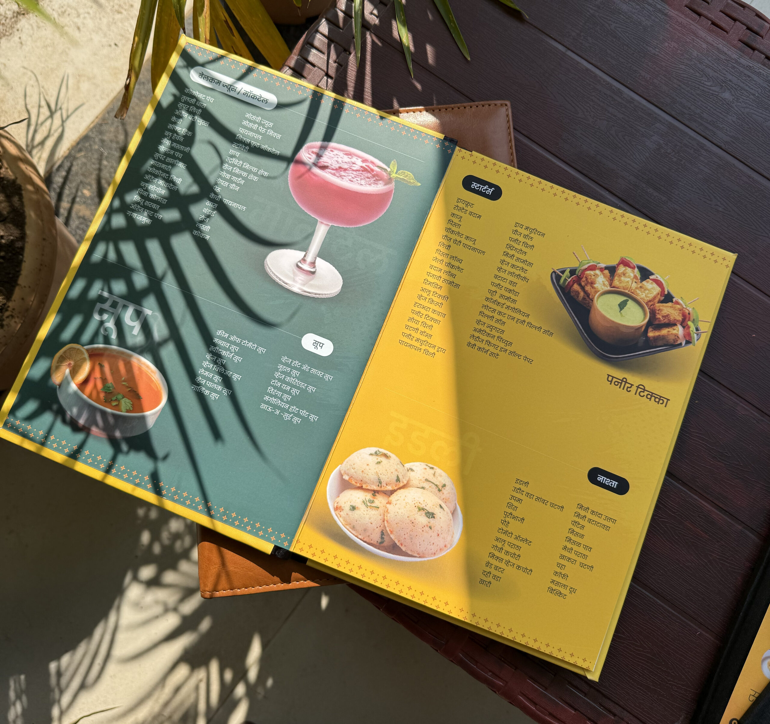
The Game-Changer: Food Colors Instead of Dusty Themes


Earlier menus used:
- Brown
- Grey
- Beige
- Dark dull tones
But food is NOT dull.
Food is:
- Bright 🍔
- Fresh 🥗
- Vibrant 🍕
- Juicy 🍗
So we introduced food-based color psychology into menu design.
What we changed:
- Used red, yellow, orange tones (increase appetite)
- Added contrast backgrounds for readability
- Highlighted best-selling items with color blocks
Result:
Customers started noticing menus more and engaging instantly.
Fonts That Talk, Not Just Sit
Another big mistake in traditional menus was font selection.
Most menus used:
- Generic fonts
- Small sizes
- No hierarchy
We changed that.
Our font strategy:
- Bold headings for categories
- Clean, readable fonts
- Proper spacing
- Highlighted pricing
Now customers can:
✔ Scan quickly
✔ Understand easily
✔ Decide faster
The 60% Image – 40% Text Strategy (Our USP)
This is where Aveera Design stands out the most.
We introduced a proven formula:
👉 60% Images + 40% Text Menu Layout
Why this works:


7
From our real experience working with 300+ restaurants:
- People are lazy to read long text
- Customers prefer visual decisions
- Images create instant craving
- Photos reduce decision time
Real behavior we observed:
👉 Customers point directly to images
👉 Orders increase for items with photos
👉 Premium-looking menus build trust
Psychology Behind Image-Based Menus
Let’s break this down simply:
When a customer sees:
- A dish name → they think
- A food image → they feel
And food is all about feeling, not thinking.
That’s why:
- Burgers look juicy
- Pizzas look cheesy
- Desserts look irresistible
👉 The moment customers “feel hungry,” they order faster.
Layout Transformation: From Confusion to Clarity
Traditional menus:
- No structure
- Too many items together
- No visual flow
Our modern layouts:
- Clean sections
- Proper spacing
- Highlighted best-sellers
- Easy navigation
What we focus on:
- Eye movement flow
- Visual hierarchy
- Product positioning
We design menus in a way that:
👉 Customer’s eyes go exactly where we want
👉 High-margin items get more attention
👉 Decision-making becomes effortless
Results Restaurants Are Seeing
After redesigning menus with Aveera Design, restaurants have reported:
- Increased order value
- Faster decision-making
- More orders for highlighted items
- Better customer experience
And the biggest one:
👉 Customers actually enjoy browsing the menu
From Pune to the World 🌍
We are proud to say:
- 300+ restaurant menus delivered in India 🇮🇳
- Clients in:
- Germany 🇩🇪
- USA 🇺🇸
- UAE 🇦🇪
- Dubai
- Canada 🇨🇦
Starting from Pune, we have grown into a globally trusted menu design partner.
Why Restaurants Trust Aveera Design
We are not just designers.
We understand:
- Restaurant psychology
- Customer behavior
- Sales-driven design
What makes us different:
✔ Real experience with 300+ restaurants
✔ Proven design formula (60% image strategy)
✔ Focus on increasing orders
✔ Fast delivery & premium quality
✔ Strong presence on Google & social media
Pune’s Leading Menu Design Experts
Being based in Pune, we have worked with:
- Cafes
- QSR brands
- Fine dining restaurants
- Street food chains
And we are known for one thing:
👉 “Design that actually increases sales”
The Future of Menu Cards
Menu design is evolving fast.
The future is:
- Visual-first menus
- QR-based digital menus
- Minimal text
- High-quality food photography
Restaurants that adapt will win.
Those who don’t will stay stuck.
Final Thoughts: Is Your Menu Helping You Sell?
Ask yourself:
- Does your menu create craving?
- Is it easy to scan?
- Are your best items highlighted?
- Does it look modern?
If the answer is “No” — you are losing orders every day.
Let’s Upgrade Your Menu 🚀
At Aveera Design, we don’t just design menus.
We design sales machines.
If you want your restaurant to:
✔ Look premium
✔ Attract more customers
✔ Increase orders
Then it’s time to switch to a modern, high-converting menu design.
Ready to transform your menu?
Connect with Aveera Design today
and bring your menu from boring → powerful.