A restaurant menu card is not just a price list. It is one of the strongest sales tools inside your restaurant or cafe. A well designed menu can silently guide customers to order more, choose premium items, and increase the overall bill amount without any pressure from staff. Many successful restaurants earn more simply because their menu is planned strategically, not randomly designed.
In this blog, we will explain how to design a restaurant menu card that converts better, increases cravings, and boosts high value orders. We will cover fonts, colors, pricing strategy, item placement, photoshoot angles, image usage, and how big brands use menu psychology to increase revenue.
Understand the Purpose of Your Menu Card
Before starting design, you must understand one thing clearly. Your menu card is not meant to show everything equally. Its purpose is to highlight what you want to sell the most. Most restaurant owners try to give equal importance to all items. This is a big mistake.
A high converting menu card focuses only on two or three most profitable items. These items should get maximum attention through font size, placement, images, and description. When customers feel confident choosing these items, the bill value naturally increases.
Choosing the Right Fonts for Restaurant Menu Design
Font selection plays a major role in menu readability and customer perception.
Use easy to read fonts for item names and descriptions. Script or decorative fonts look attractive but should be limited to headings only. For food items and prices, always use clean and simple fonts.
Avoid using more than two font styles in one menu card. One font for headings and one for item names and prices is enough. Too many fonts confuse customers and make the menu look unprofessional.
Premium restaurants usually use thin serif fonts or modern sans serif fonts. These fonts create a feeling of quality and trust. Budget cafes often use bold and playful fonts to show affordability. Choose fonts based on your brand personality.
Font size also matters. High margin items should have slightly larger font size compared to normal items. This draws attention naturally without looking forced.
Color Psychology in Menu Card Design
Colors influence appetite and spending behavior more than most people realize.
Warm colors like red, orange, and dark yellow increase hunger and impulse ordering. That is why many fast food brands use these colors. Premium restaurants prefer dark backgrounds like black, charcoal, or deep green combined with gold or white text to create a luxury feel.
Do not use too many colors. Stick to two or three main colors that match your restaurant interior and brand identity. A clean and balanced color palette keeps the menu professional and easy to scan.
Highlight best selling or recommended items using subtle color boxes or icons. Avoid bright highlight colors everywhere, as it reduces the impact.
Smart Pricing Strategy That Increases Bill Amount
Pricing presentation is more important than pricing itself.
Avoid using currency symbols repeatedly. Writing prices without the currency sign reduces price sensitivity in customers minds. Instead of writing Rs 249, simply write 249.
Do not align prices in a straight column. When prices are aligned vertically, customers compare prices and choose the cheapest option. When prices are placed just after item names, customers focus more on food than cost.
Introduce a premium anchor item. This is a high priced item placed near your best sellers. When customers see a very high price first, the rest of the menu feels affordable, and mid range items sell more.
Bundle items where possible. Combos and add ons increase average order value without resistance.
Focus Only on Two or Three Most Selling Items
One of the most important rules of high converting menu design is focus.
Do not try to promote everything. Select only two or three items that give you the highest profit or are most popular. These items should be placed at prime viewing areas of the menu.
Prime areas are the top right corner, center of the page, and first few items under each category. Customers eyes naturally move to these areas first.
Use short and mouth watering descriptions for these items. Describe texture, taste, and ingredients briefly. Avoid long paragraphs.
Add small tags like Chef Special, Bestseller, Recommended, or Most Loved near these items. These tags create trust and social proof, encouraging customers to order confidently.
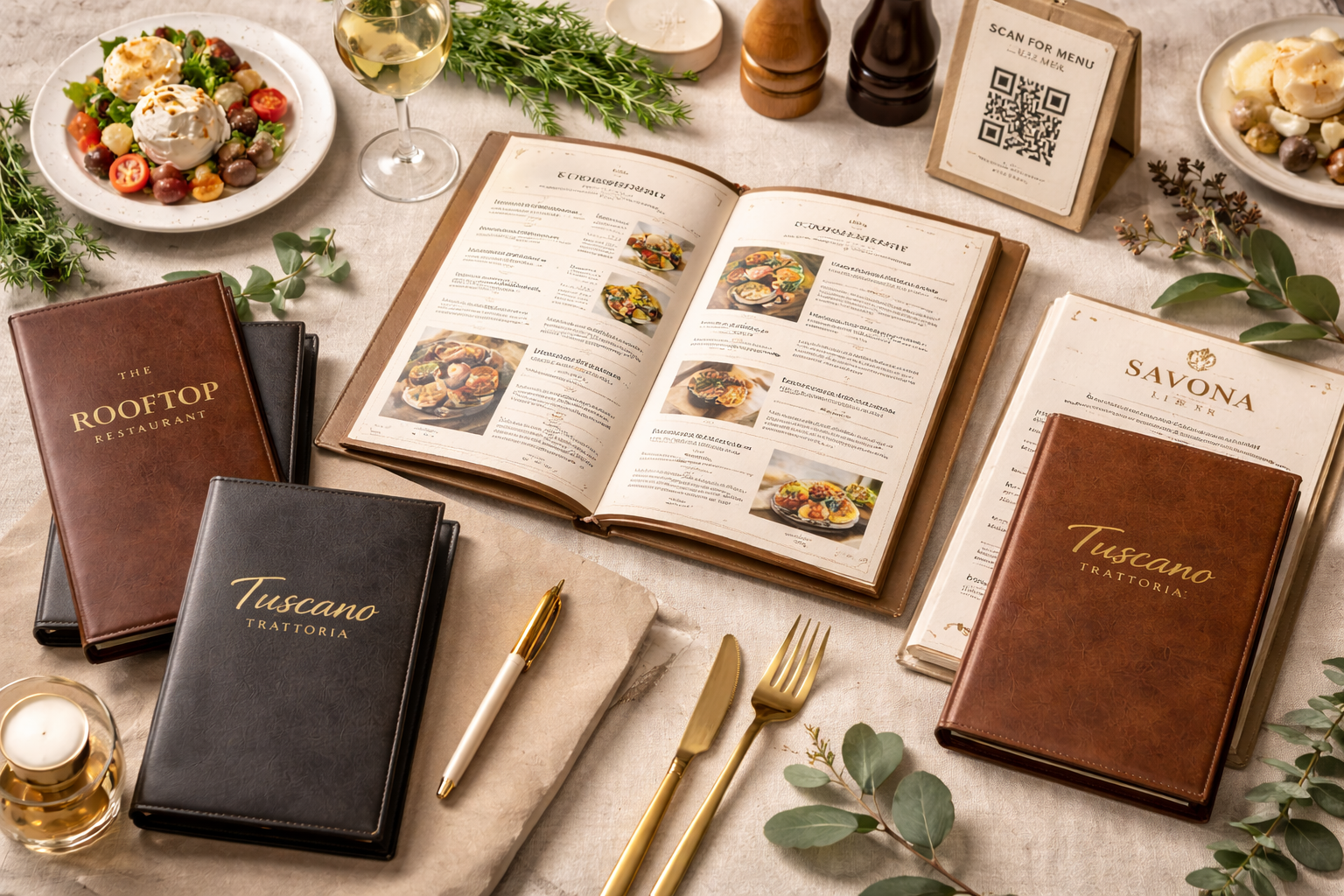
Importance of Professional Food Photos
Images sell food faster than words.
Most big restaurant brands use large, high quality food images to trigger cravings. The size of the image matters. Bigger images create stronger emotional response and make customers imagine the taste.
Food photos should look real, fresh, and well styled. Avoid over edited images. Natural lighting works best.
Very important point is image angle. Always use forty five degree angle photos or top angle photos. These angles show depth, texture, and portion size clearly. They look premium and appetizing.
Flat front angle photos often look boring and less appealing. Forty five degree and top angle shots are proven to perform better in menus and online platforms.
Add Price on the Actual Photo
Most restaurant owners avoid adding price on food photos. This is a missed opportunity.
When price is added directly on the image, customers associate the visual craving with the price instantly. This reduces hesitation and speeds up decision making.
Use subtle typography for price on image. Do not make it bold or aggressive. Keep it clean and premium.
This technique is widely used by big brands and premium cafes because it increases conversion without verbal selling.
Keep Menu Layout Clean and Structured
White space is your friend.
Do not overcrowd the menu with too many items, boxes, or decorations. A clean layout improves readability and makes premium items stand out.
Group similar items properly. Use clear headings. Maintain consistent spacing between items.
If your menu is too long, consider using multiple pages instead of cramming everything into one page. A relaxed customer spends more time reading and ordering.
Why Menu Card Design Should Be Done by Professionals
Menu design is a mix of psychology, branding, photography, and layout strategy. It is not just graphic design.
Professional menu designers understand customer behavior, eye movement, pricing psychology, and brand positioning. A professionally designed menu can recover its cost within weeks by increasing average bill value.
Random design or copy paste templates fail to create impact and often confuse customers.
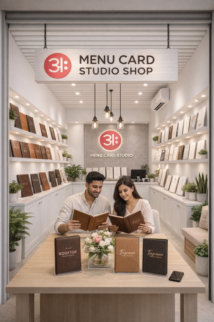
Choose Aveera Design Solutions for High Converting Menu Cards
If you want your restaurant or cafe menu card to look premium and convert into higher sales, trust Aveera Design Solutions.
Aveera Design Solutions is a Pune based design agency specializing in restaurant and cafe branding. We understand local market behavior, food business challenges, and customer psychology deeply.
We design menu cards that are not only beautiful but also strategic. From font selection and color planning to pricing layout and food photo placement, every detail is crafted to increase your revenue.
Whether you run a cafe, fine dine restaurant, cloud kitchen, or fast food outlet, our team designs menus that match your brand and attract the right customers.
Give your menu card to Aveera Design Solutions and experience the difference of professional restaurant branding. A well designed menu is not an expense, it is an investment that pays back every single day.